boyst Posted September 18, 2013 Posted September 18, 2013 What ya think... Everyone NFL team emblem redesigned. Some are pretty wacky, but most are pretty cool. They did a great job. http://imgur.com/gallery/yGJKk
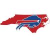
Dorkington Posted September 18, 2013 Posted September 18, 2013 Love most of them. I like the Bills logo, but without the football player in it.
Bills!Win! Posted September 18, 2013 Posted September 18, 2013 the 49ers looks like the Buffalo Sabres if you look at it for a while
BillsFan-4-Ever Posted September 18, 2013 Posted September 18, 2013 the Bills is OK. don't care much for the color scheme . the red and blue are off an angry cardinal..... interesting
Clippers of Nfl Posted September 18, 2013 Posted September 18, 2013 they are off on the san diego chargers. lol. it's electricity. chargers. bolts. not horses. Actually the more i see them the more i dont like them. some are damn good some are damn bad! gb and ny giants are ugly. Love most of them. I like the Bills logo, but without the football player in it. they were probably going for buffalo and guy named bill
You herd it hear last Posted September 19, 2013 Posted September 19, 2013 Nice! They should remove the teeth from the jaguar, for realities sake. But most of em are very cool. I like one of the comments below the article that says the Bills logo looks like a crab in the thumbnail version. so true.
Clippers of Nfl Posted September 19, 2013 Posted September 19, 2013 The dog for the browns is awesome. their team, not so much. at least it's an easy win for us!!!
maddenboy Posted September 19, 2013 Posted September 19, 2013 Dawg for the browns is excellent. Bills is not bad. But the horns need to be bigger. The Bengals look like an embryo. Or a shrimp that needs to be peeled and eaten.
Clippers of Nfl Posted September 19, 2013 Posted September 19, 2013 Dawg for the browns is excellent. Bills is not bad. But the horns need to be bigger. The Bengals look like an embryo. Or a shrimp that needs to be peeled and eaten. I was thiking the same thing too. The cat's tail starts at the head of the tiger???
ajzepp Posted September 19, 2013 Posted September 19, 2013 Love most of them. I like the Bills logo, but without the football player in it. It would be perfect if the team ever moves to Pamplona The Bengals look like an embryo. Or a shrimp that needs to be peeled and eaten. It reminded me of a curled poop.
RuntheDamnBall Posted September 19, 2013 Posted September 19, 2013 I like the Cincinnati Bengals larvae.
BuffalothruMyVeins Posted September 19, 2013 Posted September 19, 2013 I usually think the re-imagined logos look really dumb, but I really like just about all of these, except for the Steelers, Bengals, Ravens, and Cowboys... and the Giants' interlocking letteringg one is somewhat confusing, whereas the interlocked lettering is cool for the Packers.
run dat back Posted September 19, 2013 Posted September 19, 2013 Bills - lose the player and the red shoulder patch. Pats - going back to old school. Can't decide if I like it or not. Ravens - downgrade from current logo Bengals - Tiger prawn?? Steelers - what's the significance of the three bars? The three rivers? It doesn't work for me. Texans - would be good if the Chicago Bulls hadn't done it first. Jags - not much different from current logo Titans - lose the flowing hair and you might have something, but their current logo is too sick to change. Broncos - if you were marketing My Little Pony, maybe. That's an abomination. Chiefs - too complex, and the arrow suggests pointing to the past instead of the future. Chargers - seriously, what is with these animals curving like shrimp? Cowboys - No, just no. That's an L. Giants - is it a logo or a subway system map? Eagles - another too similar. If you are going to redesign it, then REDESIGN it. Bears - is it a bear? Is it a wolf? A dog? What is it?? Lions - looks like something from the Lion King or other kids' cartoon. Awful. Green Bay Packers - interesting. Would never have the fans' buy-in. Now excuse me, I have to go watch a Legendary Pictures movie Vikings - what the heck is that?? Looks like the king from the LA Kings jersey. Terrible. 49ers - the football at the bottom looks like a zero. Bad idea. Seahawks - not bad considering the current logo is one of the most awkward in the league. Not much room for a new direction here.
Uncle Monkeyhead Posted September 19, 2013 Posted September 19, 2013 they are off on the san diego chargers. lol. it's electricity. chargers. bolts. not horses. Actually the more i see them the more i dont like them. some are damn good some are damn bad! gb and ny giants are ugly. they were probably going for buffalo and guy named bill Actually they are correct on the Chargers. Double meaning. Check out the old shield logo
Just Jack Posted September 19, 2013 Posted September 19, 2013 Steelers - what's the significance of the three bars? The three rivers? It doesn't work for me. Almost like it was the last one they were doing and couldn't think of anything.
Just in Atlanta Posted September 19, 2013 Posted September 19, 2013 (edited) Some of these are quite good. The Dolphins logo is quite better than the hotel thing they currently have. Browns logo, great. The Bengals look like a larvae though. Edited September 19, 2013 by Just in Atlanta
Beerball Posted September 19, 2013 Posted September 19, 2013 Anyone else think that the cowboy was a witch?
RuntheDamnBall Posted September 19, 2013 Posted September 19, 2013 Anyone else think that the cowboy was a witch? I thought it was Christopher Walken.
boyst Posted September 19, 2013 Author Posted September 19, 2013 Anyone else think that the cowboy was a witch? CGF?
Bills!Win! Posted September 19, 2013 Posted September 19, 2013 Is it just me or is the saints and panthers exactly the same as before

Recommended Posts